Visions 07 — Lighting and Color Balance

When talking about color balance, the first thing I need to say is that it is a perception. Colors within a space can be easily influenced by the products within the store, materials used, angles of lighting, source of lighting as well as file processing techniques. Even eyeglasses can affect our perception of color if the glass is tinted or darkened.
That being said, I feel that when we look at a retail photograph, we need to have a neutral. This sets the balance to the viewer and gives them a frame of reference to work with. This way, gross and very subtle colors are seen and perceived as correct. A great reference for this would be the Jeff Ruby Steakhouse I recently photographed. You can view the images here. Notice how even though there are major colors within each scene, a visual neutral is present allowing the viewer to accept the rest of the scene as accurate. This allows the warm chandeliers, ruby ceiling, and purple backbar to look as intended.
I have found that a total neutral site looks incorrect, almost as a rendering. I feel the eyes expect color shifts over a scene dependent upon what is in the scene. Merchandise colors as well as colors within the store need to reflect somewhat into neutral walls and ceilings. Sites with wood need to be a bit warmer and neutral sites a bit cool.
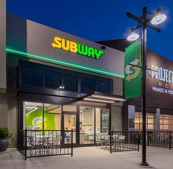
Exteriors usually have additional issues due to the fact that interiors are usually a warm color balance while daylight is fairly blue. I like to photograph these types of images in the evening as the sun is going down. The late night sky warms a bit and seems to balance better to the interior warmth. Also, this allows us to see the inside of the site without the daylight reflections.
Photographers take differing approaches to handling color. Some balance each light source on site to neutral, while others shoot and balance later in processing. I photograph a color checker within each light source, use software to balance the colors and create a profile. I then use that profile as a reference when processing the files. This allows me to create a very specific reference to that site alone, which I use as the basis for file processing. I then may shift and correct from there. Also, remember that viewing platforms can make a difference as well, although this is less a problem today as in the past. My work monitors are calibrated and profiled weekly to insure a correct visual environment with which to work.
If you have any questions or comments, please feel free to contact me. It’s always nice to chat.